
Recently, psychology researchers from the Kellogg School of Business at Northwestern University published an article entitled “Data Visualization: More than Pretty Pictures.” We at VizExplorer, of course, absolutely loved the article since this is the mantra we’ve been espousing for years!
In the article, Associate Professor Steven Franconeri, Ph.D., gives readers, among many very interesting insights, four very sage best practices:
- “If you do it [visualizations] wrong, it’s a disaster… it can be complete spaghetti.”
- “If you have a relatively simple data set, create three or four different visualizations.”
- “…step away from the traditional bullet-pointed slides and start integrating visuals into their presentations… because no one can read and listen at the same time.”
We obviously agree with Dr. Franconeri wholeheartedly and are proud to say that VizExplorer helps our clients achieve these goals on a daily basis.
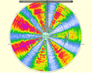
Above, we see VizExplorer’s Temporal Super Graphic. Each dot of the circle represents one hour within one year, color coded by casino player count and allows operators to easily see how marketing events affect patron volume. Without this proprietary way of viewing this data, casino operators have to navigate multiple spreadsheets and graphs (and potentially making “complete spaghetti”) to find trends that the Temporal can reveal in minutes.
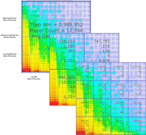
Similarly, our unique Quartal Super Graphic gives you multiple ways to review data in new and unique ways. In this example, we are viewing Average Monthly Visits plotted against Average Daily Theoretical Worth to be able to quickly see who are most valuable customers are (those with many visits each month who also spend the greatest amounts) and vice-versa which we then can divide into quarters, sixteenths, and so on.
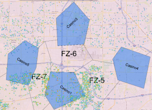
Finally, we see a Spatial Super Graphic displaying players plotted on a map, color coded by value, along with a casino’s competitive set thus establishing “fight zones.” As you can see, this picture is indeed worth a thousand words. If you know that “Casino5” is going to run a large promotion, there’s no need to put together an elaborate presentation to discuss your findings, simply start planning on how to market to everyone in Fight Zone 7!
Of course, these are just a handful of examples of VizExplorer’s award-winning capabilities that span from our unique visualizations to advanced data analytics and contact management solutions all built by casino operators, for casino operators. To learn more about how our team can help you maximize the use of your data, visit our website at http://www.vizexplorer.com/request-a-demo/.
Oh, and the fourth best practice?
“People might think that visualizations are pretty and they’re icing… That’s not true. They are indispensable, absolutely indispensable.”
WE COULDN’T AGREE WITH YOU MORE!
To read more:
http://insight.kellogg.northwestern.edu/article/more-than-pretty-pictures
http://www.psychology.northwestern.edu/people/faculty/core/profiles/steven-franconeri.html
Request a demo today!

Trent Dang
Senior Industry Specialist
VizExplorer
Leave a Comment